Terms & Conditions:
- This promotion is open to all UK residents, including Isle of Man, aged over 18 years. Excludes residents from the Republic of Ireland and employees of Currys Group Limited and their families, agents (including affiliates), suppliers and anyone connected to this promotion.
- The prize draw is free to enter and no purchase is necessary.
- All entries must be submitted by registering with the iD Mobile Community and providing an answer to the question on the corresponding topic thread. Only one entry per person is permitted. All entries must comply with the iD Community Standards: https://community.idmobile.co.uk/site/terms.
- The opening date for entries is 09:00 AM on 1st July 2026. The closing date of the prize draw is 09:00 AM on 1st August 2026. Entries received after this time will not be valid.
- The entry must be submitted personally by the entrant. Entries by 3rd parties, collective entries or multiple entries will be disqualified. If it becomes apparent that a participant is using a computer(s) to circumvent this or any other condition by, for example, the use of ‘script’, ‘brute force’ or any other automated means, that person’s entries will be disqualified, and any prize award will be void.
- The Promoter accepts no responsibility for lost or incomplete entries. Incomplete, illegible, invalid, or misdirected entries will not be accepted.
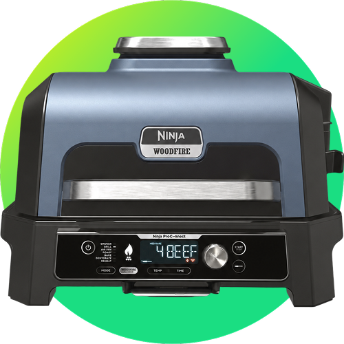
- There will be 1 winner that will win a NINJA Woodfire Pro Connect XL OG903UK Outdoor Electric BBQ Grill & Smoker with Cover – Black & Blue.
- A winner will be chosen by random draw within 7 days of the closing date.
- The winner will be notified by email or by private message on the iD Community platform using the details provided at entry before 1st August 2026 and must provide a postal address to claim their prize. If a winner does not respond to the Promoter within 7 days of being notified by the Promoter, then the winner's prize will be forfeited. The Promoter will be entitled to select another winner in accordance with the process described above.
- The prize is supplied by Currys Group Limited (the "Supplier"). The Promoter reserves the right to replace the prize with an alternative prize of equal or higher value if the prize in unavailable.
- The prize for the winner is non-exchangeable, non-transferable and no cash alternative is offered.
- The prize will be sent to the winner by post within 30 days of being notified of their win.
- The decision of the Promoter is final and binding and no correspondence will be entered regarding the outcome of this promotion.
- The Promoter reserves the right to hold void, cancel, suspend, or amend the promotion where it becomes necessary to do so.
- Promoters must either publish or make available information that indicates that a valid award took place. To comply with this obligation the Promoter will send the surname and county of major prize winners and, if applicable copies of their winning entries, to anyone who sends request at the address below within one month after the closing date stated in condition 4. You can object to any or all of your surname, county and winning entry being published or made available by contacting the Promoter at the address below. In such circumstances, the Promoter must still provide the information and winning entry to the Advertising Standards Authority on request.
- If you are the winner of this promotion, we may ask for your consent to participate in publicity arising from the prize draw. This will be entirely optional for the winner and the Promotor will only use the winner’s details with their express permission. The Promoter reserves the right to use non-identifiable details for advertising and promotional purposes in connection with the promotion in all media without further notice.
- The Promoter will at all times comply with data protection legislation when collecting and processing data. The Promoter will only use the personal details supplied for the purposes of administering the Promotion. Your personal details will at all times be kept confidential and in accordance with current data protection legislation. To view the Promoter’s Privacy Policy visit: https://www.idmobile.co.uk/legal/privacy-and-cookies. If you would like to request access to your personal data, or have inaccuracies rectified, please visit the Promoter’s privacy policy for details of how to contact us.
- By participating in the promotion, entrants are deemed to have accepted these terms and conditions. The Promoter reserves the right to refuse entry, or refuse to award the prize to anyone in breach of these terms and conditions.
- English law applies to these terms and conditions. If any entrants to this promotion wish to take court proceedings, then they must do this within the courts in the United Kingdom.
- iD Mobile hold the right to change the start and/or end date of the competition at any given time.
Promoter: iD Mobile, Currys Group Limited, 1 Portal Way, London W3 6RS.